Monday, 9 May 2011
Sunday, 8 May 2011
Wednesday, 27 April 2011

Tuesday, 5 April 2011
The Art of Manga in relation to our project and Evaluation question number one.
 Manga consists of comic and print cartoons based on an art developed in Japan in the late 19th century. Since the 1950`s they have become a major part in the Japenese publishing industries and in 2008 the US and Canadian Manga market was £175,000,000. Comic historians argue that Manga is a modern age. It appeals alot to boys and young men, that became the earliest readers of Manga after World War two. From the 1950`s onwards it focused on including topics thought to intrest the normal boy. In terms of females, Manga has evolved considerably to involve single females and women or groups of heavily armed female warriors to surrond the hero. There was a relaxtion of censorhsip in the 1990`s but in 2010 they past a bill to resist harmful content.
 Manga consists of panels like motion pictures that reveals details of actions boardering slow motion as well as rapid zooms to close up shots. Our project develops conventions similar to those of the art form "Manga". In the beggining of our teaser trailer two close up shots are used on the girls face and on the fire exit sign. Shots similar to these close ups are often used in Manga texts. They are generally used to create tension or put across a message. Our teaser is similar in the sense that we used a close up of a fire exit sign as it is nationally icon symbol that is associated with panic and a way out. The panning shot and then close up of the girl at the beggining of our trailer also develops the conventions of Manga art as similar shots are used in many Manga style texts. The idea of using sound and almost static shots is also a trate of our trailer which develops the conventions of the manga art form. We used panning shots of actors which are dead still added with the voice over to create tension, this technique is extremely common in Manga, such texts as " Naruto Manga " use similar techniques to build tension and to convey their message.

These stills used in Manga are said to be there to let the audience take in what is going on and to make their own perception of what they are viewing. Our Text being a teaser develops this as the aim of teasers is to tease the audience into wanting to watch the film. Our teaser using these stills entices the audience in the same sense that Manga uses them to entice the audience into wanting to watch the text. However we also challenged the conventions of Manga style art as we used these stills to atteact the audience not to help the audience make their own perception of the text.
- Elias and Jack-
Thursday, 24 March 2011
Initial review of Evalution Task
The evaluation task requires our group to address four questions on the production and finished product of our main and ancillary tasks. In order for us to create a compelling, reflective and subjective evaluation, we knew that it had to be rich in content based on audience feedback collected from a variety of angles, as well as including our own views on how succesfull our finished project has been. Moreover we wanted to use a range of mediums to create a finished evaluation that would allow us to fully learn from any mistakes, while also remembering any specific techniques that worked to help with any future media productions we may embark on.
The questions were as follows:
Q1 In what ways does your media product use, develop or challenge forms and conventions of real media products?
Q2 How effective is the combination of your main products and ancillary texts?
Q3 What have you learnt from your audience feedback?
Q4 How did you use media technologies in the construction and research, planning and evaluation stages?
To begin to evaluate, we first had to collect audience feedback from a number of different perspectives to see whether our production would be appreciated by a variety of audiences. Our first and primary feedback was from our classmates and teacher, this would run under the category of an active audience because they would be critically viewing our film and ancillary texts on the basis of not only their knowledge of the subject, but also drawing upon their own experience of media production. Secondly we showed other students at school that don't study media to see if our production would appeal to a younger audience, similarly we also showed other teachers at school to see if they had any criticisms or praises to make These would both fall under the category of a passive audience, but this is also important feedback because ultimately this would be the majority of viewers if our film were to screened like any other media product.
While we want to be creative in the mediums in which we convey our evaluation, we felt that its important to gather together all of our feedback and own views before hastily going into the construction of the 'evaluation film'. So we have set appointments for our group to meet up to discuss the content that we wish to include.
We have decided to use a podcast, interview style film, and a 'prezi' presentation that will be filmed as we preform it in class. By using these mediums we believe that we are more likely to use the points of evaluation in any other media productions because it will be more accessible and memorable in the future, as apposed to a mere written piece. Furthermore we feel we need the use of images and possibly video clips to put our points across more clearly to the audience.
Stephen
Wednesday, 16 March 2011
DocuSoap Case Study
Definition:
DocuSoaps are simply a form of reality TV, however certain elements differentiate it from mainstream viewer-led television such as talk shows and the likes of Jeremy Kyle. Similarly, it isn't 'access television' (Which from my understanding is a predominantly American form of TV created by ordinary people and non-profit organization, might be worth looking into), since the audience is in fact the subject of the program.
Can be defined as a program about ordinary people or events, made by professionals to entertain and instruct.
General Structure of DocuSoaps.
Narration plays a very influential part, since narration is likely to increase viewer involvement and add another layer of representation through meta-narratives. Dramatic reconstructions may also be used to further the cause. Story lines often follow a weekly structure (Notting Hill 2010) possibly providing firm viewing numbers. The stories are real, and therefore connect to the audience in a very real way, since the issues raised are particularly key debates or areas of interest in the media world at the current time (Britney and Kevin: Chaotic - Bricolage of home videos in order to set up the narrative, and professional filming in order to tell it).
DocuSoaps are cheap to produce, easy to work to within deadlines and can be aired immediately. However this raises other issues. The British DocuSoaps are not particularly involving when compared to North American alternatives. For example Airport and Airline were two of the best and most viewed DocuSoaps in the United Kingdom, however when compared to the scale of North American counter-parts such as Ace of Cakes, Ice Road Trucks, Miami Ink, Deadliest Catch and Storm Chasers, not only does it effectively describe the type of target audience but it also shows what people find involving and of interest. DocuSoaps also can be considered educative as well as entertaining. This authoritative stand may give them a lot of appeal to the average television viewer.
"Reality TV shares many of the characteristics Modelski assigns to fictional soap operas such as a participatory quality; a sense that characters or social situations are 'like me'...and emphasis in knowledge of what others might do and think...rather than strictly factual 'know-how'; acceptance and acknowledgement that viewers are subject to 'interruption, distraction and spasmodic toil'; multiple plot lines; and casts of characters who may not know each other."
Bill Nichols, Blurred Boundaries: Questions of Meaning in Contemporary Culture.
Elias
Monday, 28 February 2011
The History of Zombie Films.
When a famous psychologist "Milgram" was questioned about why people are drawn to such gore as shown in zombie films, he gave this response.
"The attraction of some to the zombie and the genre of films in which they appear represents an inner desire to place blame for society’s misgivings on the establishment, i.e. big business, big government, etc. and use the zombie as the most logical outcome if the establishment were to be left unchecked by a complacent population."
In other words this is the idea that an audience is drawn to zombie genered films as it puts the blame of societys downfalls on the bigger institutions such as the government and as a result subconciously makes the individual feel better about these mishaps in society, Zombie films can also often get at the idea of society becoming an extremely commercialsed place. The population can be complacent and as a result society has become commercially controlled to a certain level. Many modern day zombie films are set in shoppping centres or malls this is getting at this idea once again but through the motion of picture and potraying it through the downfall of the victims in these texts.
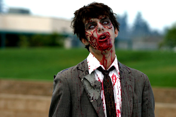
 Before 1968 zombie films were something completley different, Zombies were potrayed as corpses who were removed from their grave after death and turned into mindless scary looking slaves, who were usually ordered about by a particular master, a good example of a zombie having a master is "Frankenstein". Films of this time which also followed these aspects of a zombie film are " White Zombie"(1932) and "Revenge of the Zombies" (1943). The zombie shown on screen often had blackened faces and white clear eyes as shown in the photo on the right hand side of the page. They would also shown little facial expression if any atall.
 In the 1968 the birth of a modern type of zombie was born, This began when the film " The Night of the Living Dead" was released, a hole new era of Zombie films was started by the director of this text "George A Romero. Its said he is responsible for the creation of a whole new type of Zombie films starting with "The night of the living dead" and continuing all the way to modern day.
In the 1980`s Zombie films took off, titles such as "Day of the Dead " and " The Dead next Door " sent zombie films in the right direction and made them what they are today. During the 80`s and the production of these films certain unofficial rules were created as a norm to follow when producing a zombie film. Rules such as if you didnt die first then you aren`t a zombie. Zombies aren`t cannibals, they only feed on living human flesh. The only way to stop a zombie is a well placed head shot, which is the most dominant rule still existing in most zombie films in present day. And last but not least Zombies arent the most intelligent of things.
In the 1990`s Zombie films seemed to take a bit of a turn for the worst as none of the relased zombie pictures did very well with some exceptions, films such as "Braindead" (1992) and "Dead men Dont Die" (1990) whihc both managed to hit the box office and attract quite a big audience of horror lovers.
 From the 1990`s to Present day Zombie films only seemed to improve, with the release of such zombie films as " 28 days later", " Shaun of the Dead" and a remake of the motion picture " Dawn of the Dead " which were all sucessful apon release.
 - JACK-
Thursday, 24 February 2011
Ancillary Task Draft: Magazine Front Cover

The programme I used to make this draft was Adobe Photoshop CS2, it took me quite some time to produce as I am not firmly familiar with Photoshop. However, my understanding of the tools and applications it has to offer is increasing.
The base of the magazine was an A4 sheet of paper, which certainly needed colour. I applied the black-to-grey gradient from top to bottom to give the area hosting the title more prominence, while also attracting attention to the bottom half where the main picture was to be placed.
The title was intended to stand-out in front of everything else, this was through various methods. Firstly, the contrast of red-on-black is very high, it also reaches out to the consumer due to connotations associated with the colour red.
I used the style 'sun faded photo' to mask the title, this gives the title a solid-glow outline, making it more aesthetically pleasing to the consumer. Also, the 'movie prime' lens flare behind the '+' in the title adds to the pleasing aesthetics. It also acts as a reassurance to the consumer that they are getting 'more' for their money. These glows accompanying the title add a sense of synergy to the magazine cover, which is very important in media.
I added the 'UK £3.50', the magazine's URL, issue number and date to simply make the magazine look more realistic. Also, the presence of the price of the magazine acts as an incentive for the consumer to purchase it.
The synergy of colours is important as it allows the potential buyer to skim read the coverlines and the main story -Which need to be fairly short and snappy-. The synergy also compliments the main point-of-focus which is DEAD RUN, while establishing and maintaining an ongoing theme.
The coverlines I created are intended to inform the reader of upcoming films, while also playing with the words. This gives them a colloquial tone, which makes it more enjoyable to read. For example, the upcoming prequel 'X-Men: First Class' was turned into the coverline 'X-Men get First Class treatment'. And the reboot of Thor was turned into 'Thor takes on a makeover' - Carries out the 'action' theme of the film and also refers to it being a reboot (makeover). It adds a humorous tone too, simply by having 'Thor' and 'makeover' in one sentence.
'We battle..' and 'We reveal..' provides an inclusive tone for the consumer and also utilises the 'PLUS' motion by giving the consumer more.
The main image took a long time to fine-tune and organise, here are the original images:

Both images were cropped to a reasonable size then layered onto the magazine cover. There was a big problem, both backgrounds didn't fit well together. I used the 'magic eraser' to get rid of everything apart from the zombies themselves. This process became quite tedious after a while, as I had to pick out 'bits of sky' in between strands of hair on the second picture (featured as the foreground on the magazine), so i was left with some blue spots on the final product. But they didn't look too bad.
Ben
Tuesday, 8 February 2011
First Draft - ANCILLARY TASK MOVIE POSTER

Fullsize: http://img651.imageshack.us/img651/3535/helfposter.jpg
The idea of the poster was to present the main characters in a mysterious light, whilst also being able to convey the notion of the narrative taking place in a school. This was slightly problematic right from the off-set, the idea of school isn't exactly a frightening one. Schools generally represent normality, education and an area of work. We wanted to be able to accurately depict the idea of the school so the horror elements within the narrative can have a more in-depth effect to the audience, due to the fact the environment doesn't contain any fantasy or out of the world elements. This is what we tried to achieve with this photo.
However there are certain elements which could be worked on. Using exif data (data stored within a photo whenever it is taken, we can see various elements of the photograph. I will be explaining the technical aspects and why the problems that are in the current poster have occurred, and what I will do to better and solve them in the next attempt.

Exif data is stored in the photo and shows us numerous elements. Ranging from the camera used down to the colour encoding and even the date (Only shows date inputted on the camera itself, so it may be wrong). First I want to talk about the lens. I used a 28mm lens since at the moment it is the lowest focal length I had. Ideally I would've used a 16mm wide angle in order to take up more of the walls surrounding the subjects in order to give the photo more depth. This would allow the characters to stand out further and be more centered within the frame. It would also give me more space to work with when adding elements to the photo, such as titles and extras. However wide angle lenses are out of my price range, so for my next attempt I will be using the same lens. This brings me to my next point which would be the exposure time and ISO. Exposure time is a term that describes the way a photo is taken, which is essentially a shutter moving from a closed to an open position to expose the sensor. The longer the shutter is open, the more photons and light are absorbed by the sensor, therefore in dark environments, such as the environment the photo was taken, in order to get the perfect exposure the shutter speed would have to be slower. I didn't have a tripod on that day so camera shake was a bit of a worry, however there is no visible shake or distortion in the photo. Since I didn't have a tripod I had to make a compromise; ISO is another term for sensor sensitivity, i.e how much light it takes in. If an ISO is very high, the sensor will take in more light, as you can see in the image above the ISO was set to 6100, which is almost the maximum ISO. However there is a drawback, high ISO leads to alot of noise in the photos. This is clearly visible, not only does it make the photo look unimpressive and lack detail, in a way it completely ruins the immersion the audience may have when viewing the poster. Most cameras have native ISO, when a camera is used at it's native ISO the image quality is generally the best the camera can offer. I will use ISO 100 at my next attempt in order to get more quality out of the photo. This means that I would have to increase the shutter time so the photo can be exposed perfectly, so it will require the subjects to remain very still for a considerable amount of time.
Another issue with the photo is that school corridors are generally plain and unexciting or appealing to the eye. Apart from choosing another environment, I will have to add various photoshop effects in order to make the photo appealing, but not over do it so the realistic and grounded elements of the film are not mistaken for fantasy and imaginative ideas.
--Elias
--Elias
Friday, 4 February 2011
Post Modernism
Anagram
B.&.H P.A.I.N.P.I.P.E.S
Bricolage
Hyper Reality
Pastiche
Asthetics
Irony
Nihlism
Nihlism
Parody
Intertexuality
Playfulness
Eclectic
Self Referential
Wednesday, 2 February 2011
Sunday, 30 January 2011
Other ways of distributing short films.
Short amateur films in past have been a thing of family sharing. Traditionally, apart from a few films such as 'The Blair Witch Project' have seldom seen a huge group of audience, or have achieved any fame or recognition in terms of cinematography; but is all this about to change?
With the introduction of Youtube around 2005, it is clear many aspiring film directors and critics have made an attempt in reaching audiences through the outlet. I will be analysing three types of short film I have found which I believe are amongst some of the most successful in their category.
First up, it's Sintel.
With the introduction of 3d Animation being accessible to everyone who owns a computer and a little know-how, in my opinion we will be seeing alot more of these. Blender is a completely free-ware program, and the creators have decided to showcase what can be achieved through the program itself. If this isn't inspiring enough, this short film captures emotion and represents life and reality in a way I have never seen before. You follow the story of a young girl who meets a wounded baby dragon, after nurturing for the little creature, it gets stolen away from her. Without giving too much away, she practically forgets about everything else apart from a way to get the dragon back, but she eventually finds out that her greed and jealousy ends up killing her. I believe this movie is one of the most incredible pieces of media placed on youtube. It doesn't boast an exceptional amount of views, but with minimal to none advertisement, due to the target audience is predominantly people who are familiar with Blender, which in all fairness isn't exactly mainstream culture, even for 3d modellers. But it shows what a well thought out story, a little imagination and a team of good modellers with a vision can do to the industry.
--Elias
Thursday, 13 January 2011
Filming
Today, as a group, we started to film our project. This consisted of meeting up with our chosen actors, discussing what they will be doing and how they will be doing it. Briefing actors beforehand is essential to creating the right mood on camera, as they can be fully informed on what they're going to be doing.
Location-wise, we filmed at different parts of our school, one advantage of this is that we knew our way round the site, making it easier to navigate our team.
We didn't aim to shoot the whole teaser trailer in one session as this would be slightly too optimistic. We managed to get a range of shots and upload them to a mac at the school.
By Group
Subscribe to:
Comments (Atom)