
The programme I used to make this draft was Adobe Photoshop CS2, it took me quite some time to produce as I am not firmly familiar with Photoshop. However, my understanding of the tools and applications it has to offer is increasing.
The base of the magazine was an A4 sheet of paper, which certainly needed colour. I applied the black-to-grey gradient from top to bottom to give the area hosting the title more prominence, while also attracting attention to the bottom half where the main picture was to be placed.
The title was intended to stand-out in front of everything else, this was through various methods. Firstly, the contrast of red-on-black is very high, it also reaches out to the consumer due to connotations associated with the colour red.
I used the style 'sun faded photo' to mask the title, this gives the title a solid-glow outline, making it more aesthetically pleasing to the consumer. Also, the 'movie prime' lens flare behind the '+' in the title adds to the pleasing aesthetics. It also acts as a reassurance to the consumer that they are getting 'more' for their money. These glows accompanying the title add a sense of synergy to the magazine cover, which is very important in media.
I added the 'UK £3.50', the magazine's URL, issue number and date to simply make the magazine look more realistic. Also, the presence of the price of the magazine acts as an incentive for the consumer to purchase it.
The synergy of colours is important as it allows the potential buyer to skim read the coverlines and the main story -Which need to be fairly short and snappy-. The synergy also compliments the main point-of-focus which is DEAD RUN, while establishing and maintaining an ongoing theme.
The coverlines I created are intended to inform the reader of upcoming films, while also playing with the words. This gives them a colloquial tone, which makes it more enjoyable to read. For example, the upcoming prequel 'X-Men: First Class' was turned into the coverline 'X-Men get First Class treatment'. And the reboot of Thor was turned into 'Thor takes on a makeover' - Carries out the 'action' theme of the film and also refers to it being a reboot (makeover). It adds a humorous tone too, simply by having 'Thor' and 'makeover' in one sentence.
'We battle..' and 'We reveal..' provides an inclusive tone for the consumer and also utilises the 'PLUS' motion by giving the consumer more.
The main image took a long time to fine-tune and organise, here are the original images:
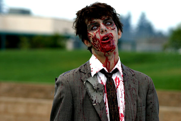

Both images were cropped to a reasonable size then layered onto the magazine cover. There was a big problem, both backgrounds didn't fit well together. I used the 'magic eraser' to get rid of everything apart from the zombies themselves. This process became quite tedious after a while, as I had to pick out 'bits of sky' in between strands of hair on the second picture (featured as the foreground on the magazine), so i was left with some blue spots on the final product. But they didn't look too bad.
Ben
No comments:
Post a Comment