Monday 28 February 2011

The History of Zombie Films.

When a famous psychologist "Milgram" was questioned about why people are drawn to such gore as shown in zombie films, he gave this response. 

"The attraction of some to the zombie and the genre of films in which they appear represents an inner desire to place blame for society’s misgivings on the establishment, i.e. big business, big government, etc. and use the zombie as the most logical outcome if the establishment were to be left unchecked by a complacent population."
  
In other words this is the idea that an audience is drawn to zombie genered films as it puts the blame of societys downfalls on the bigger institutions such as the government and as a result subconciously makes the individual feel better about these mishaps in society, Zombie films can also often get at the idea of society becoming an extremely commercialsed place. The population can be complacent and as a result society has become commercially controlled to a certain level. Many modern day zombie films are set in shoppping centres or malls this is getting at this idea once again but through the motion of picture and potraying it through the downfall of the victims in these texts. 

Before 1968 zombie films were something completley different, Zombies were potrayed as corpses who were removed from their grave after death and turned into mindless scary looking slaves, who were usually ordered about by a particular master, a good example of a zombie having a master is "Frankenstein". Films of this time which also followed these aspects of a zombie film are " White Zombie"(1932) and "Revenge of the Zombies" (1943). The zombie shown on screen often had blackened faces and white clear eyes as shown in the photo on the right hand side of the page. They would also shown little facial expression if any atall. 

In the 1968 the birth of a modern type of zombie was born, This began when the film " The Night of the Living Dead" was released, a hole new era of Zombie films was started by the director of this text "George A Romero. Its said he is responsible for the creation of a whole new type of Zombie films starting with "The night of the living dead" and continuing all the way to modern day. 

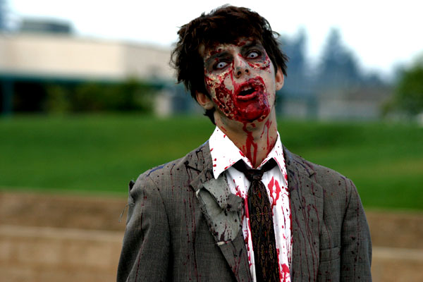
In the 1980`s Zombie films took off, titles such as "Day of the Dead " and " The Dead next Door "  sent zombie films in the right direction and made them what they are today. During the 80`s and the production of these films certain unofficial rules were created as a norm to follow when producing a zombie film. Rules such as if you didnt die first then you aren`t a zombie. Zombies aren`t cannibals, they only feed on living human flesh. The only way to stop a zombie is a well placed head shot, which is the most dominant rule still existing in most zombie films in present day. And last but not least Zombies arent the most intelligent of things. 

In the 1990`s Zombie films seemed to take a bit of a turn for the worst as none of the relased zombie pictures did very well with some exceptions, films such as "Braindead" (1992) and "Dead men Dont Die" (1990) whihc both managed to hit the box office and attract quite a big audience of horror lovers. 
From the 1990`s to Present day Zombie films only seemed to improve, with the release of such zombie films as " 28 days later", " Shaun of the Dead" and a remake of the motion picture " Dawn of the Dead " which were all sucessful apon release.


         - JACK-


Thursday 24 February 2011

Ancillary Task Draft: Magazine Front Cover


The programme I used to make this draft was Adobe Photoshop CS2, it took me quite some time to produce as I am not firmly familiar with Photoshop. However, my understanding of the tools and applications it has to offer is increasing.
The base of the magazine was an A4 sheet of paper, which certainly needed colour. I applied the black-to-grey gradient from top to bottom to give the area hosting the title more prominence, while also attracting attention to the bottom half where the main picture was to be placed.

The title was intended to stand-out in front of everything else, this was through various methods. Firstly, the contrast of red-on-black is very high, it also reaches out to the consumer due to connotations associated with the colour red.
I used the style 'sun faded photo' to mask the title, this gives the title a solid-glow outline, making it more aesthetically pleasing to the consumer. Also, the 'movie prime' lens flare behind the '+' in the title adds to the pleasing aesthetics. It also acts as a reassurance to the consumer that they are getting 'more' for their money. These glows accompanying the title add a sense of synergy to the magazine cover, which is very important in media.
I added the 'UK £3.50', the magazine's URL, issue number and date to simply make the magazine look more realistic. Also, the presence of the price of the magazine acts as an incentive for the consumer to purchase it.
The synergy of colours is important as it allows the potential buyer to skim read the coverlines and the main story -Which need to be fairly short and snappy-. The synergy also compliments the main point-of-focus which is DEAD RUN, while establishing and maintaining an ongoing theme.

The coverlines I created are intended to inform the reader of upcoming films, while also playing with the words. This gives them a colloquial tone, which makes it more enjoyable to read. For example, the upcoming prequel 'X-Men: First Class' was turned into the coverline 'X-Men get First Class treatment'. And the reboot of Thor was turned into 'Thor takes on a makeover' - Carries out the 'action' theme of the film and also refers to it being a reboot (makeover). It adds a humorous tone too, simply by having 'Thor' and 'makeover' in one sentence.
'We battle..' and 'We reveal..' provides an inclusive tone for the consumer and also utilises the 'PLUS' motion by giving the consumer more.

The main image took a long time to fine-tune and organise, here are the original images:


Both images were cropped to a reasonable size then layered onto the magazine cover. There was a big problem, both backgrounds didn't fit well together. I used the 'magic eraser' to get rid of everything apart from the zombies themselves. This process became quite tedious after a while, as I had to pick out 'bits of sky' in between strands of hair on the second picture (featured as the foreground on the magazine), so i was left with some blue spots on the final product. But they didn't look too bad.


Ben

Tuesday 8 February 2011

First Draft - ANCILLARY TASK MOVIE POSTER

Fullsize: http://img651.imageshack.us/img651/3535/helfposter.jpg

The idea of the poster was to present the main characters in a mysterious light, whilst also being able to convey the notion of the narrative taking place in a school. This was slightly problematic right from the off-set, the idea of school isn't exactly a frightening one. Schools generally represent normality, education and an area of work. We wanted to be able to accurately depict the idea of the school so the horror elements within the narrative can have a more in-depth effect to the audience, due to the fact the environment doesn't contain any fantasy or out of the world elements. This is what we tried to achieve with this photo.

However there are certain elements which could be worked on. Using exif data (data stored within a photo whenever it is taken, we can see various elements of the photograph. I will be explaining the technical aspects and why the problems that are in the current poster have occurred, and what I will do to better and solve them in the next attempt.


Exif data is stored in the photo and shows us numerous elements. Ranging from the camera used down to the colour encoding and even the date (Only shows date inputted on the camera itself, so it may be wrong). First I want to talk about the lens. I used a 28mm lens since at the moment it is the lowest focal length I had. Ideally I would've used a 16mm wide angle in order to take up more of the walls surrounding the subjects in order to give the photo more depth. This would allow the characters to stand out further and be more centered within the frame. It would also give me more space to work with when adding elements to the photo, such as titles and extras. However wide angle lenses are out of my price range, so for my next attempt I will be using the same lens. This brings me to my next point which would be the exposure time and ISO. Exposure time is a term that describes the way a photo is taken, which is essentially a shutter moving from a closed to an open position to expose the sensor. The longer the shutter is open, the more photons and light are absorbed by the sensor, therefore in dark environments, such as the environment the photo was taken, in order to get the perfect exposure the shutter speed would have to be slower. I didn't have a tripod on that day so camera shake was a bit of a worry, however there is no visible shake or distortion in the photo. Since I didn't have a tripod I had to make a compromise; ISO is another term for sensor sensitivity, i.e how much light it takes in. If an ISO is very high, the sensor will take in more light, as you can see in the image above the ISO was set to 6100, which is almost the maximum ISO. However there is a drawback, high ISO leads to alot of noise in the photos. This is clearly visible, not only does it make the photo look unimpressive and lack detail, in a way it completely ruins the immersion the audience may have when viewing the poster. Most cameras have native ISO, when a camera is used at it's native ISO the image quality is generally the best the camera can offer. I will use ISO 100 at my next attempt in order to get more quality out of the photo. This means that I would have to increase the shutter time so the photo can be exposed perfectly, so it will require the subjects to remain very still for a considerable amount of time.

Another issue with the photo is that school corridors are generally plain and unexciting or appealing to the eye. Apart from choosing another environment, I will have to add various photoshop effects in order to make the photo appealing, but not over do it so the realistic and grounded elements of the film are not mistaken for fantasy and imaginative ideas.

--Elias

Friday 4 February 2011

Post Modernism

Anagram

B.&.H P.A.I.N.P.I.P.E.S
Bricolage
Hyper Reality
Pastiche
Asthetics
Irony
Nihlism
Parody
Intertexuality
Playfulness
Eclectic
Self Referential

Wednesday 2 February 2011